


I have used some data about urbanisation in Namibia which I downloaded from the Open Data for Africa website. This data shows some nice variation across the regions of Namibia.
Here is an example of the what can be done:

Here is the code and maps made along the way:
START
## map urbanisation data onto Namibia administrative regions.
## step 1: download the map data
## download the file...
library(sp)
link <- "http://biogeo.ucdavis.edu/data/gadm2.8/rds/NAM_adm1.rds"
download.file(url=link, destfile="file.rda", mode="wb")
gadmNab <- readRDS("file.rda")
## step 2: simplify the level of detail...
library(rmapshaper)
gadmNabS <- ms_simplify(gadmNab, keep = 0.01)
plot(gadmNabS)

## step 3: turn it into a ggplot object and plot
library(broom)
library(gpclib)
library(ggplot2)
namMapsimple <- tidy(gadmNabS, region="NAME_1")
ggplot(data = namMapsimple,
aes(x = long, y = lat, group = group)) +
geom_polygon(aes(fill = "red"))

# check region names
unique(namMapsimple$id)
# the exclamation mark before Karas will cause a problem.
namMapsimple$id <- gsub("!", "", namMapsimple$id)
# check it worked
unique(namMapsimple$id)
# now no exclamation mark
## step 4: let's get our data and bind it...
# download the data about urbanisation
library(RCurl)
x <- getURL("https://raw.githubusercontent.com/brennanpincardiff/learnR/master/data/Namibia_region_urbanRural.csv")
data <- read.csv(text = x)
# exclude whole country
data_regions <- data[!data$region=="Namibia",]
# so extact 2011 data from the data_regions
data_regions2011 <- data_regions[data_regions$Date == 2011, ]
# just extract urban
data_regions2011_urban <- data_regions2011[data_regions2011$residence == "Urban",]
# change colnames so that we can merge by id...
data_col_names <- colnames(data_regions2011_urban)
data_col_names[1] <- c("id")
colnames(data_regions2011_urban) <- data_col_names
# bind the urbanisation data into map with merge
mapNabVals <- merge(namMapsimple,
data_regions2011_urban,
by.y = 'id')
p <- ggplot() + # sometimes don't add any aes...
geom_polygon(data = mapNabVals,
aes(x = long, y = lat,
group = group,
fill = Value))
p

# plot the outlines of the administrative regions
p <- p + geom_path(data=namMapsimple,
aes(x=long, y=lat, group=group))
p

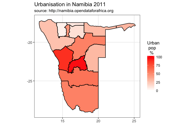
p <- p + scale_fill_gradient("Urban\n pop\n %",
low = "white", high = "red",
limits=c(0, 100))
p

p <- p + coord_map() # plot with correct mercator projection
p

# add titles
p <- p + labs(x = "", # label x-axis
y = "", # label y-axis
title = "Urbanisation in Namibia 2011",
subtitle = "source: http://namibia.opendataforafrica.org")
p + theme_bw()
# maybe get rid of long, lat etc..
p <- p + theme_bw() +
theme(panel.grid.minor=element_blank(), panel.grid.major=element_blank()) +
theme(axis.ticks = element_blank(), axis.text.x = element_blank(), axis.text.y = element_blank()) +
theme(panel.border = element_blank())
p # show the object

## add names of regions
library(rgeos)
# calculate centroids
trueCentroids = gCentroid(gadmNabS,byid=TRUE)
# make a data frame
name_df <- data.frame(gadmNab@data[,'NAME_1'])
centroids_df <- data.frame(trueCentroids)
name_df <- cbind(name_df, centroids_df)
colnames(name_df) <- c("region", "long", "lat")
# label the regions
p <- p + geom_text(data = name_df,
aes(label = region,
x = long,
y = lat), size = 2)
p

# change different colours
p + scale_fill_gradient("Urban\n population\n %",
low = "white", high = "blue")

p + scale_fill_gradient("Urban\n pop\n %",
low = "white", high = "green")

# If you want to save this... export or use the ggave() function
p + ggsave("Namibia_Urbanisation_Map_2011.pdf")
END
Resources:
- More maps on RforBiochemists:
- I found this stackoverflow answer very useful
- Data sources for Namibia
- Plotting Country maps in R using GADM data
No comments:
Post a Comment
Comments and suggestions are welcome.