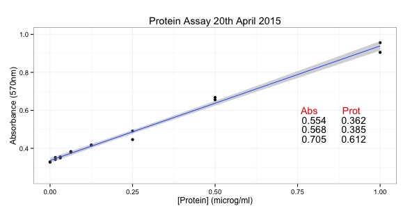
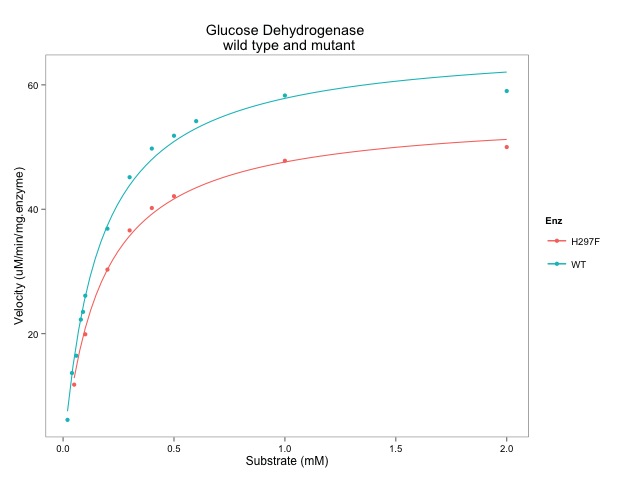
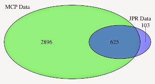
Here is the graph, drawn with ggplot:
Updated 22nd July 2021: The data should be available from the Mol Cell Proteomics but it's not there any more. The file is available on Github and this script links and downloads directly.
START
library(ggplot2)
link <- ("https://raw.githubusercontent.com/brennanpincardiff/RforBiochemists/master/data/mcp.M114.044479.csv")
data<-read.csv(link, header=TRUE)
data$threshold = as.factor(data$P.Value < 0.05)
##Construct the plot object
g <- ggplot(data=data,
aes(x=Log2.Fold.Change, y =-log10(P.Value),
colour=threshold)) +
geom_point(alpha=0.4, size=1.75) +
xlim(c(-6, 6)) +
xlab("log2 fold change") + ylab("-log10 p-value") +
theme_bw() +
theme(legend.position="none")
g
# The script gives a warning message: Removed 1 rows containing missing values (geom_point).
# but it still works....
These pages helped me write this script:


Hello, I am trying to test your code in proteomic data in which I have a first column named Protein Accession.
ReplyDeleteI would really thank you If you could tell me how to label the dots in accordance to Protein Accession (even if possible with No overlaping, but that is secondary).
Thank you very much in advice,
By the way, the code works perfectly!
Julia Bauzá
Sorry Julia,
DeleteI missed your comment in my email overload in November. Do you still want help with this?
Best wishes,
Paul
Thank you so much for it!
ReplyDeleteThank you
ReplyDelete